Health Screening Across East Africa: A Visual Journey
Explore the shift from paper registers to dynamic data visualization in East African health screening programs and its impact on public health.
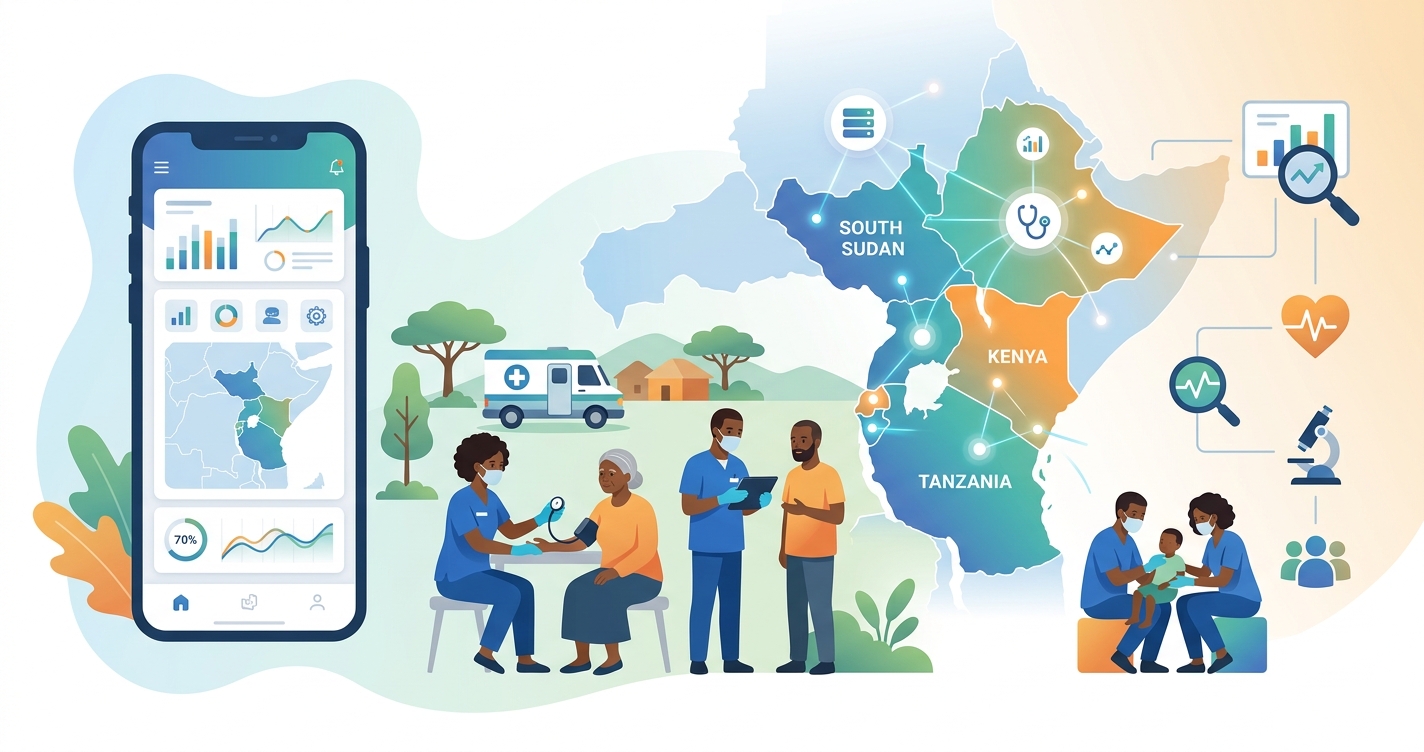
Health screening in East Africa is undergoing a profound transformation. What has traditionally been captured in paper registers and handwritten logs is rapidly moving into digital formats, creating an unprecedented opportunity to visualize population health trends. This shift from static, siloed data to dynamic, interactive dashboards is enabling public health officials, researchers, and community health workers (CHWs) to see and understand health patterns in new ways. The use of health screening East Africa visual data tools is no longer a novelty but a core component of effective public health strategy, allowing for more targeted interventions, efficient resource allocation, and a deeper understanding of program impact across diverse communities.
"A 2021 study by KEMRI-Wellcome Trust researchers found that interactive data dashboards improved the interpretation of malaria surveillance data by 40% among district health managers in Kenya, demonstrating a significant leap in data-driven decision making."
The evolution of health data visualization
The transition from paper-based to digital health data has been a long-standing goal for many health systems in East Africa. However, it is the visualization of this data that is unlocking its true potential. Early digital systems often replicated the limitations of their paper predecessors, acting primarily as static repositories. Today, platforms like DHIS2, OpenMRS, and other custom-built systems are increasingly integrated with powerful data visualization tools. These tools transform raw numbers into intuitive maps, charts, and graphs, making complex health information accessible to a wider range of stakeholders. For instance, a CHW in rural Uganda can use a tablet to view a color-coded map of their village, instantly identifying households with children overdue for vaccinations. This immediate, visual feedback loop is a significant departure from the delayed, aggregated reports of the past. The rise of health screening East Africa visual analytics shows the growing recognition that data, when presented effectively, can be a powerful catalyst for change.
| Data Visualization Method | Description | Strengths | Limitations |
|---|---|---|---|
| Geographic Information System (GIS) Mapping | Layering health data onto geographical maps. | Excellent for identifying geographic hotspots, tracking disease spread, and planning resource allocation. | Requires accurate location data, which can be challenging to collect in remote areas. |
| Interactive Dashboards | Web-based platforms with multiple, linked charts and graphs. | Allows users to explore data, filter results, and drill down into specific areas of interest. | Can be complex to design and may require training for users to use fully. |
| Mobile-Based Visuals | Simplified charts and alerts on mobile devices for field workers. | Provides real-time, actionable insights at the point of care or in the community. | Limited screen size can restrict the complexity of the visualizations. |
| Static Reports & Infographics | Traditional charts and graphs in printed reports or digital documents. | Useful for summarizing key findings for stakeholders and in low-connectivity settings. | Non-interactive, offering a limited view of the data without the ability to explore further. |
Industry Applications
The application of visual health screening data spans the entire public health ecosystem, from frontline workers to national policymakers.
Community health programs
For community health programs, data visualization is a game-changer. CHWs equipped with mobile apps that present data visually can better manage their workloads and prioritize home visits. For example, a visual dashboard might show a CHW which households in their catchment area have pregnant women in their third trimester, enabling timely prenatal counseling. This approach is being used in projects across Kenya and Rwanda to improve maternal and child health outcomes.
District-level health management
District Health Management Teams (DHMTs) use visual data to monitor health trends, manage supply chains, and respond to outbreaks. A study by researchers at Makerere University School of Public Health (MakSPH) in 2022 highlighted how GIS mapping of cholera cases in a Ugandan district enabled a rapid and targeted public health response, containing the outbreak more effectively than previous efforts that relied on anecdotal reports.
National policy and research
At the national level, visualized data informs policy decisions and strategic planning. The East African Community's (EAC) CommonHealth COVID-19 Data Map is a prime example of how regional data sharing and visualization can support a coordinated response to a public health crisis. Academic researchers also rely on these visualizations to analyze the effectiveness of interventions and identify new research questions, building a virtuous cycle of evidence-based practice.
Current research and evidence
The body of evidence supporting the use of data visualization in health screening is growing. A 2023 scoping review in the journal Global Health Action analyzed 50 studies on Community-Based Health Information Systems in Africa and found that data utilization, often through visual dashboards, was a key factor in program success. The review, led by researchers from the University of the Western Cape, noted that "seeing the data" empowers communities and health workers to take ownership of their health. Similarly, the Sustainable East Africa Research in Community Health (SEARCH) consortium has published numerous papers demonstrating the power of real-time data visualization in large-scale HIV prevention and treatment programs. Their work shows that providing communities with visual feedback on their collective progress toward health goals can significantly boost engagement and adherence. However, challenges remain. Issues of data quality, digital literacy, and health system infrastructure can limit the impact of these technologies.
The future of health screening visuals in east africa
The future of health screening East Africa visual technology lies in greater integration, personalization, and predictive capabilities. We can expect to see more sophisticated AI and machine learning algorithms embedded in these platforms, moving from descriptive to predictive analytics. Instead of just showing what has happened, future systems will be able to forecast potential outbreaks, identify individuals at high risk of developing chronic diseases, and recommend personalized interventions. For example, a system might analyze a combination of a person's vital signs, demographic data, and environmental factors to predict their 5-year risk of hypertension, visualizing this risk in a simple, easy-to-understand format. As connectivity improves and mobile technology becomes even more ubiquitous, the power of visual data will extend further into the community, placing actionable health insights directly into the hands of individuals and families.
Frequently asked questions
What is the biggest challenge to implementing visual health data systems? The most significant challenge is often not the technology itself, but the human and systemic factors. These include ensuring high-quality data is collected, providing adequate training for health workers and managers to interpret and use the visualizations, and establishing robust data governance and privacy frameworks.
How does data visualization help with health equity? By mapping health outcomes and service availability, data visualization can reveal hidden disparities between different geographic areas or demographic groups. This allows public health officials to target resources and interventions to the most vulnerable populations, promoting greater health equity.
Can community members without technical skills benefit from this technology? Yes. A key principle of effective data visualization is to make complex information simple and intuitive. Many projects are now co-designing their visual outputs with community members to ensure they are understandable and relevant, using familiar symbols and colors to convey health messages.
As the landscape of global health technology evolves, Circadify continues to explore and innovate in the areas of data capture and its effective presentation for decision-making. The journey of transforming health screening data into a visual narrative is a powerful step towards building healthier communities. For more on the research driving these changes, visit our research blog at circadify.com/blog.